How to Build a Stream Setup That Looks Like One Design, Not Four
A free overlay, alerts from a bundle and panels made in Canva will never look like one design. Here is what actually has to match, the order to build it in, and where to spend if the budget is small.

Most channels end up looking like a collage. A free overlay from one place, alerts from a bundle bought in a sale, panels made in Canva at midnight, a webcam frame from a YouTube tutorial. Each piece is fine. Together they read as noise, and noise is what makes a stream look temporary.
Looking consistent is cheaper than looking expensive. Here is the order to build it in, and the five things that actually have to match.
The five things that must match
- Palette. Two or three colours, used everywhere. One dominant, one accent, one for text. More than that and nothing feels intentional.
- Corner radius. Sharp corners on the overlay and rounded ones on the alerts is the single most common giveaway of a mixed set.
- Font. One for headings, one for body, and the same pair on screens, panels and schedule.
- Line weight. Thin elegant outlines next to thick cartoon ones never settle together.
- Motion. Snappy alerts with a slow dreamy transition feels like two different streams spliced together.
You can mix sources if you control those five. Most people cannot, which is why a single matching set is the shortcut.
Build in this order
Not everything matters equally. Build in the order a new viewer actually encounters your channel.
1. Stream screens
Starting Soon, Be Right Back, Ending. This is what someone sees first if they arrive early — often the only thing they see before deciding to stay. Most streamers build it last.
2. The overlay
The frame around gameplay and your webcam. Keep it thin. The job is to hold the picture, not to decorate it — if the frame is more interesting than the game, something is wrong.
3. Alerts
The moments when a viewer gives you something. They should feel like a reward and be short. Four seconds is plenty; eight is an interruption.
4. Chat and widgets
Chat on screen, a goal bar, a counter. These make the stream look alive when nothing is happening. Our chat overlay guide and stream goals guide cover both.
5. The channel page
Panels, banner, emotes, badges. Lower priority during the stream, higher priority for the person deciding whether to follow after it. The channel page guide walks through it.
Pick a theme you can live with
A theme is easier to maintain than a mood. “Cozy” is a mood; “warm wooden cafe at night” is a theme — it tells you what a new asset should look like a year from now.
Two honest questions before you commit:
- Does it fit what you actually stream? A pastel kitchen does not hold up under a horror game. If you stream variety, pick something neutral enough to survive the range.
- Will you still like it in six months? Changing a full set is a day of work and a confused audience.
We draw each theme as one set, so the overlay, screens, alerts, chat and panels share the same art, palette and motion by construction:
 Stream OverlayPurple Lo-Fi Stream Overlay
$29.99
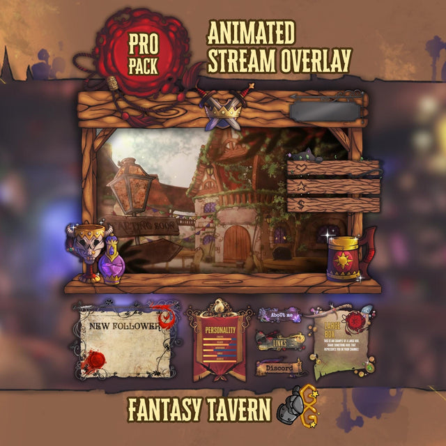 Stream OverlayFantasy Tavern Stream Overlay
$49.99
 Stream OverlayRetro Miami City Stream Overlay Pack
$29.99
Where to spend and where not to
If the budget is small, this is the honest priority order:
- Spend first on screens and the overlay. Biggest surface, longest on screen.
- Then alerts. They carry the emotional moments.
- Panels and schedule can wait. They are quick to make yourself from the same palette.
- Emotes last — and only once you have subs who will use them.
A full themed pack usually costs less than the pieces separately, which is the whole argument for buying one set rather than assembling four.
Check it the way viewers see it
- Watch your own VOD on a phone. Most of your audience is on one, and half of what looked fine on a 27-inch monitor is unreadable there.
- Screenshot the stream and look at it for two seconds, the way someone browsing the directory does. What do they learn — the game, your name, the vibe? If the answer is nothing, the frame is too busy.
- Check the overlay over a bright scene and a dark one. Most sets are only tested on one.
- Fire every alert back to back with the emulator. That is when mismatched timing becomes obvious.
The short version
Pick one theme. Build screens, then overlay, then alerts, then widgets, then the channel page. Keep the palette, radius, font, line weight and motion consistent across all of it. Check it on a phone.
Done once, you stop thinking about how your stream looks and go back to streaming — which is the actual point.